Vimal Patel22/12/21
6 min read

As online fund-raising increases, so does the importance of applying advanced digital techniques to create smooth donation experiences.
Gone from being bonus, nice-to-have income, digital donations are preparing to take centre stage.
Income from online giving rose by 97% in the year up to April 2021 and while covid restrictions forced a behavioural shift in how we donate, they merely accelerated what was already becoming a trend.
As a result, the number of options for driving digital fund-raising is increasing. They range from third-party platforms to utilising social media, and scanning QR codes to collecting donations via charities’ own websites.
In this article, we’ll look at the latter, and how charities can benefit from contemporary donation platforms which take important lessons learned from years of understanding how we all use the web.
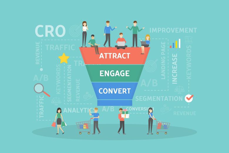
We’ll do this by delving into the art of modern-day conversion rate optimisation - known as CRO - which brings together the world of technical development, design and story-telling.
Previously, CRO had largely been the preserve of commercial businesses. If they’re selling products, they want more website visitors to buy; if they’re selling services, they want more visitors to fill in an enquiry form.
But as digital techniques grow in importance for charities, a greater emphasis needs to be placed on improving website conversion rates.
Strip away all the noise that surrounds digital and CRO is a very simple concept for charities: convert more website visitors into carrying out a desired action. In the context of this particular article, that would be donating.
Previously this might have been considered simply as ensuring a ‘Donate’ button was highly visible and easy to find, and the subsequent steps to payment being fairly easy to follow.
However, not all of those beginning this click-journey would see it through to the end. There are always people who drop-out, for a variety of reasons.
They might be wary of adding card details when they reach that particular page, they might feel that they are being asked for too much personal information, pages might not be set up correctly for mobile devices.
And a common problem is that there are just too many clicks. If you take just one thing from this article, let it be this: reduce the number of times someone has to click.
Why? Because every time you ask website visitors to complete an action - i.e. click to move on to a new page - you are opening up the opportunity for them to drop out.
We’ve seen donation journeys on big charity websites which span five pages or more, when all information could have comfortably resided on two. It’s why we have worked hard in this area on the donation platform we build for charities.
Arguably the most fundamental aspect of CRO is ensuring that any barriers to action are removed, or at least reduced i.e. the number of clicks.
On a basic level, this means clearly displaying action buttons, ensuring pages on the donation conversion journey work as well on smartphones as they do on desktop machines, forms are easy to complete and the next steps are simple to understand.
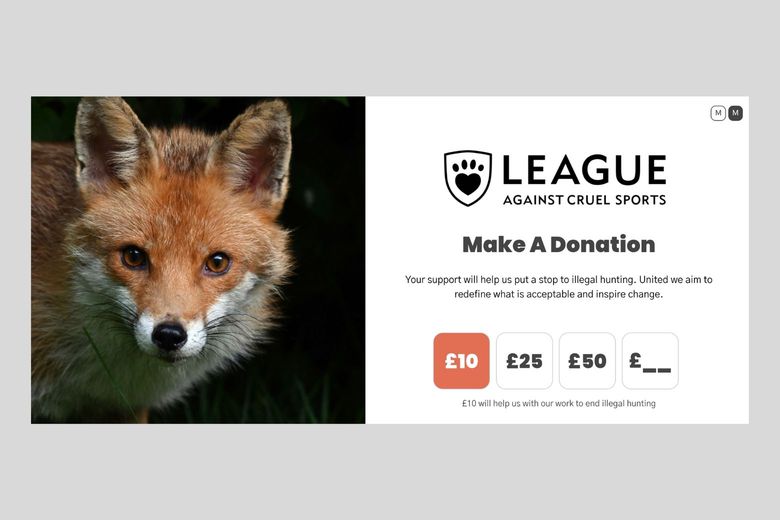
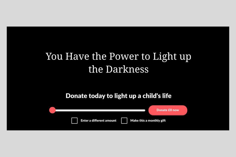
Advanced platforms also provide the functionality to make a particular donation incredibly simple. On The Pret Foundation site, you can see how they have made it easy for users to click on a set amount, or add in their own chosen donation.
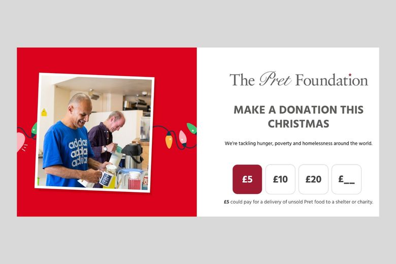
Colours are extremely important in the world of user experience (UX) development, hence the accent colour to provide extra clarity on the donation amount and the call-to-action ‘Continue’ button.
You can also see how straightforward it is for a donor to make a monthly contribution, by simply clicking a box.
One other thing you might not necessarily be immediately aware of is the lack of other distractions. Removing barriers to conversion means stripping away much of the secondary content you’d often associate with a web page.
In the example above, there is one focus for the page. There are no links to other pages, no ‘you might also like’ type messages, not even a navigation bar.
The best donation platforms also simplify forms so that they ask for the least amount of information required to complete the journey with the least amount of effort. For example, including a postcode look-up feature to aid address input.
Design and technical elements have become somewhat intertwined when building anything online, and has led to the rise of UX or user-centred design. This means designing a website, or donation platform, with users in mind and making life as easy as possible for them.
When it comes to the design specifics, there are some key areas to get right.

Firstly, a donation platform might sit on a sub-domain and, therefore, won’t automatically carry across page elements, for example the header and footer. As we’ve already seen, this can actually aid conversion by stripping away the ‘noise’ to provide a focus on the donations.
But you still need to ensure that the main donation page reassures users that they are in the right place. Therefore, you need to include your logo, and ensure fonts and colours match with your main site. You don’t want to tempt losing even a modicum of trust.
These might seem like small details, but remember: you’re aiming to remove any barriers, and this includes any concern - no matter how small - that things don’t seem quite right.
Secondly, consider your imagery carefully. Avoid using any stock photos and ensure the ones you use contain faces - they evoke more emotion.
The use of colours is not only important from a brand perspective, but also for accessibility, while intelligent use of white space always makes for a strong look, and light page backgrounds tend to result in higher conversion rates.
While some basics of good design will always remain true, adding a level of interactivity can draw potential donors deeper into your charity’s story.
Make A Wish uses interactivity to provide an instant sense of how a larger donation can help bring light to a child’s life. It’s a neat touch, and brings a sense of deeper personal involvement.

Make a wish saw a year-on-year increase of 122% in online donation revenue

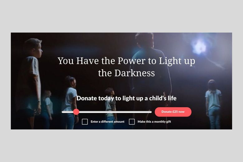
After completely redesigning and streamlining the donation journey in July 2019, the children’s charity saw a year-on-year increase of 122% in online donation revenue.
The improved journey puts supporters in control - another important element of CRO - with the freedom to choose how they wish to donate, while Apple Pay and Google Pay compatibility ensure that making a donation is quick and hassle-free, adding to the removal of any payment barrier.
Removing barriers, or reducing friction, is fundamental, but that alone doesn’t guarantee success. Some users will need encouragement - a reason to donate, and a gentle nudge to increase their donation.
This is where powerful messaging and narratives come into play. They help convert users who are showing an interest but aren’t yet fully committed to making a donation.
Suicide-prevention charity, Grassroots, cleverly change messaging and imagery to coincide with donation amounts: £7 can give 50 lifesaving suicide prevention guides to a frontline charity, £25 can teach a social worker how to spot and support someone with suicidal thoughts, and so on.
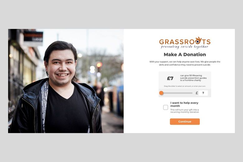
Grassroots has painted a simple, but incredibly effective, picture of how donors are helping
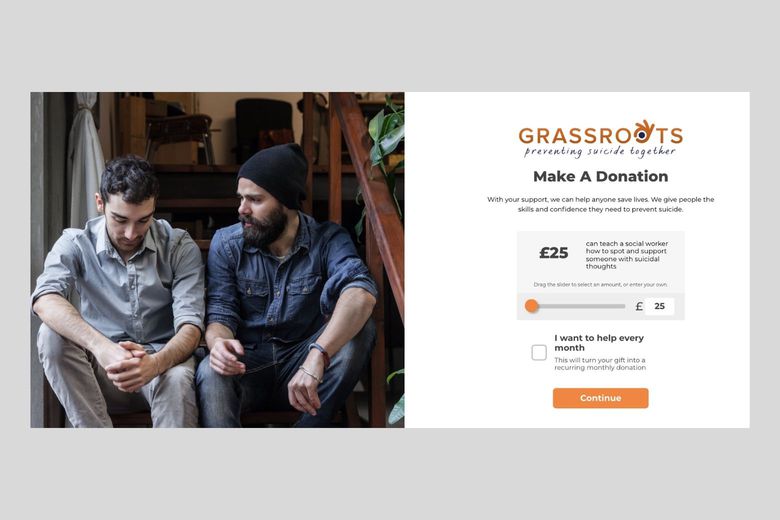
What we love about what Grassroots has done is painting a simple, but incredibly effective, picture of how donors are helping. Donations don’t just go into one big pot with decisions then made about where best to spend them - the charity proactively lets people know specifically how donations help.
It puts the benefits and outcomes front and centre - and that’s very powerful. Being able to customise your own donation platform in such a way not only helps to remove those barriers but provides the opportunity to reaffirm your unique story.
Again you can see how clear and simple it is to enter a specific amount, and make regular contributions.
We have developed and refined our own custom donation platform for charities. Key elements of this include:
The Donation Platform Dashboard we have developed allows administrators to:
We do not charge any transaction fees for donations via the platform, however the payment providers such as Stripe, Paypal and GoCardless do.
Reduce the friction - it’s what the best conversion journeys do. Just take a look at how one of the traditional donation activities occurs, and why it’s successful.
A volunteer stands in a busy high street, bucket in hand, and people dip into their pocket and throw a couple of pound coins in. For the donor, that’s as frictionless as donations come: money leaves the pocket and goes into the bucket. The end.
While there is no digital bucket, the overarching idea of reducing the amount of conversion barriers remains. That’s the primary usability goal.
Add compelling messaging to encourage those not entirely sure about why they should support you, and you’ve got the best digital donation platform at your disposal.
Share this:


Vimal Patel
Founder at Giant Digital
Vimal is Commercial Director and founding partner at Giant Digital. With digital expertise gained from over 20 years in the sector, combined with his experience as a charity Trustee, Vimal has a detailed understanding of the challenges faced by charities and is passionate about finding effective digital solutions that bring about lasting positive change.